Existing tools helped people search, not decide.
Competitor research revealed functional listings and random-choice tools, but little connection between relevant local options, group decision-making, and the social context of a specific venue.
 KEEEL
KEEELSirkiletta is a mobile experience that helps young visitors discover what is happening inside Sirkin 21, choose an activity without endless discussion, and connect with people already there.

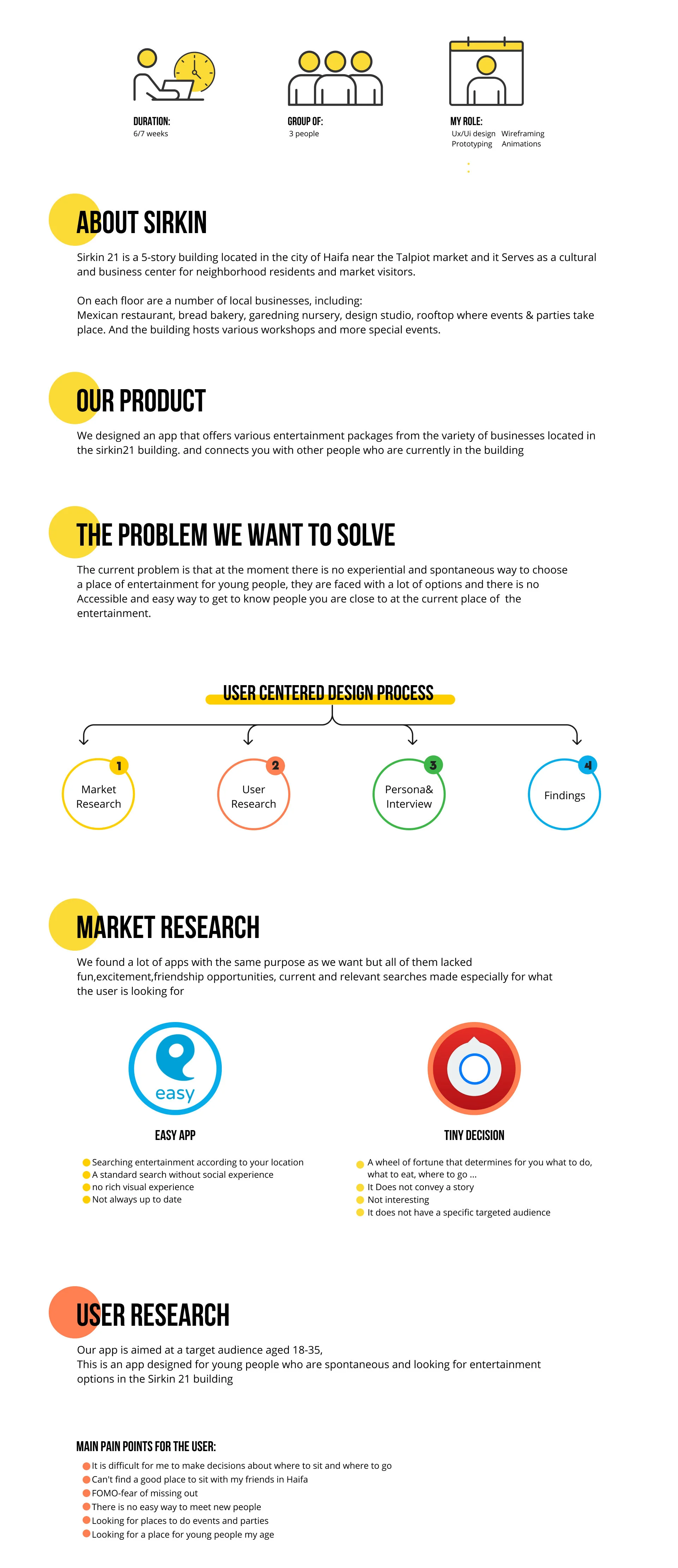
Sirkin 21 is a five-story cultural and business hub near Haifa’s Talpiot Market, home to restaurants, a bakery, a design studio, workshops, rooftop events, and other local experiences.
The opportunity was not a lack of things to do. It was the friction between having many options and making a spontaneous group decision, especially when visitors also wanted to meet people nearby.
This was an academic concept project. These figures describe the project scope and design system, not live product performance.
We moved from a broad “things to do” brief toward a more precise behavioral challenge: helping groups make a choice quickly while making nearby social participation feel accessible.
Competitor research revealed functional listings and random-choice tools, but little connection between relevant local options, group decision-making, and the social context of a specific venue.
Participants described difficulty choosing where to sit or go, fear of missing out, and no easy way to meet people nearby or find events that matched their age and mood.
We focused on people aged 18–35 looking for entertainment, social energy, and a low-effort way to turn an open-ended evening into a concrete plan.
The concept combines curated entertainment packages from businesses inside Sirkin 21 with a playful choice mechanism. Instead of asking users to evaluate every venue, it narrows the decision through mood, preference, and group context.
A social layer shows friends and people nearby, allowing a user to invite someone into a plan or see who selected the same experience. The product promise became simple: discover, decide, and join.
See relevant options within the building rather than searching the entire city.
Use guided prompts and generated packages to reduce open-ended choice.
Invite friends or find people nearby who are choosing the same plan.
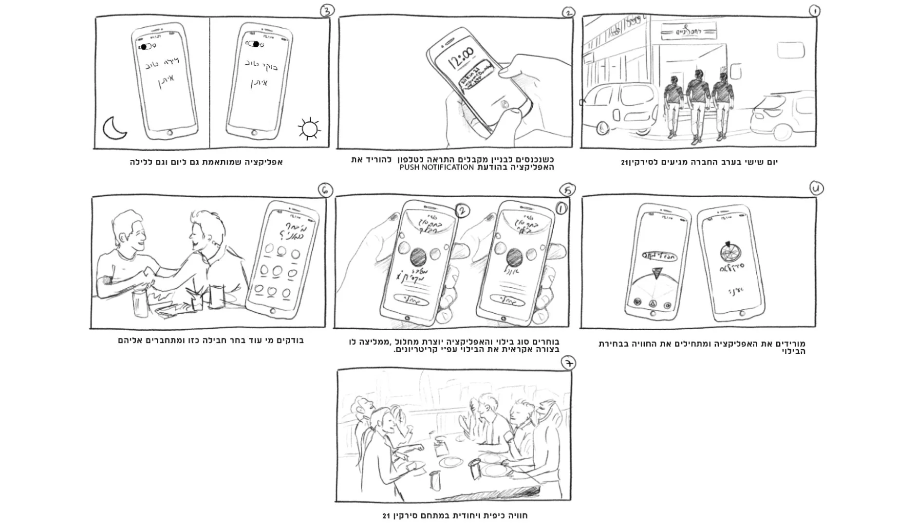
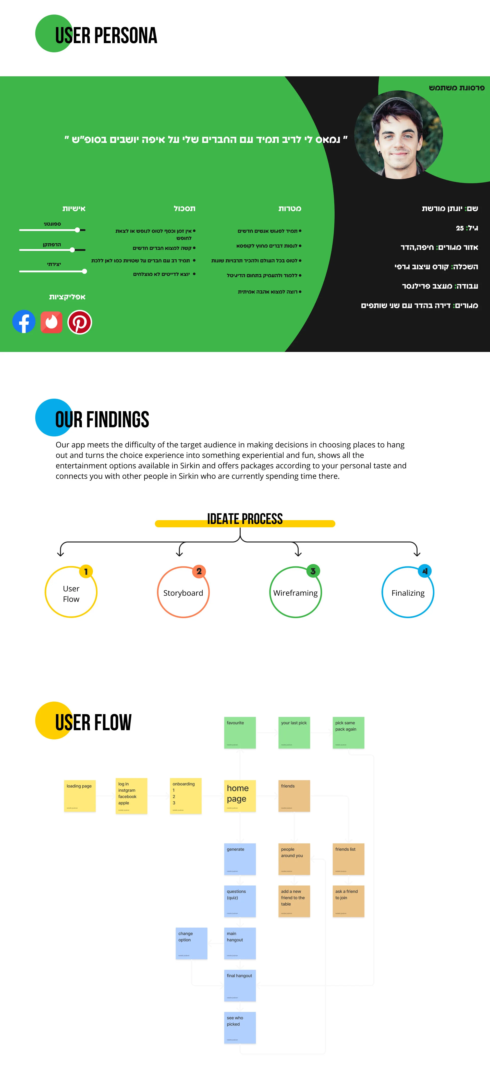
A user flow and storyboard helped us connect the digital journey to the real-life context: arriving with friends, receiving a prompt, choosing a direction, inviting others, and meeting around a shared activity.
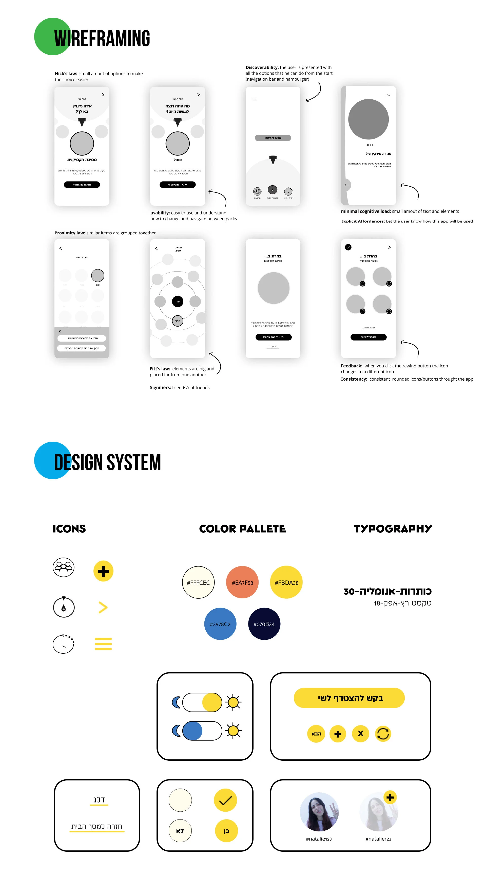
The interface was designed to reduce cognitive load, make the next action obvious, and preserve a sense of play.
Small sets of options help users move forward instead of comparing everything.
Navigation and the primary decision actions remain visible from the home screen.
Large, spaced controls support quick decisions in an active social environment.
Selected states, icon changes, and consistent controls confirm every interaction.
The visual system shifts between a light daytime interface and a dark nighttime interface while keeping the interaction model consistent. Color, illustration, rounded controls, and a compact icon language make the experience energetic without obscuring the task.
The system supports onboarding, filtering, generated packages, shared picks, invitations, friend profiles, and repeat decisions across one coherent mobile language.
The first idea was too broad“Find something to do” could easily become another listings app. Competitor and user research helped us focus on decision friction and social participation.
Playfulness needed structureThe roulette-like interaction created energy, but the flow still needed clear filters, feedback, and escape routes so chance never replaced user control.
A concept still needs honest evidenceBecause this was not a launched product, the case study focuses on research traceability, interaction rationale, and prototype completeness rather than invented impact metrics.
What I would test nextChoice completion time, confidence after a recommendation, invitation acceptance, and whether users understood why a package was suggested.
An early lesson in framing, behavioral design, product structure, and making a playful idea usable.