Treatment research was distributed
Clinicians described moving between multiple software systems, websites, books, and professional sources while reviewing a case.
 KEEEL
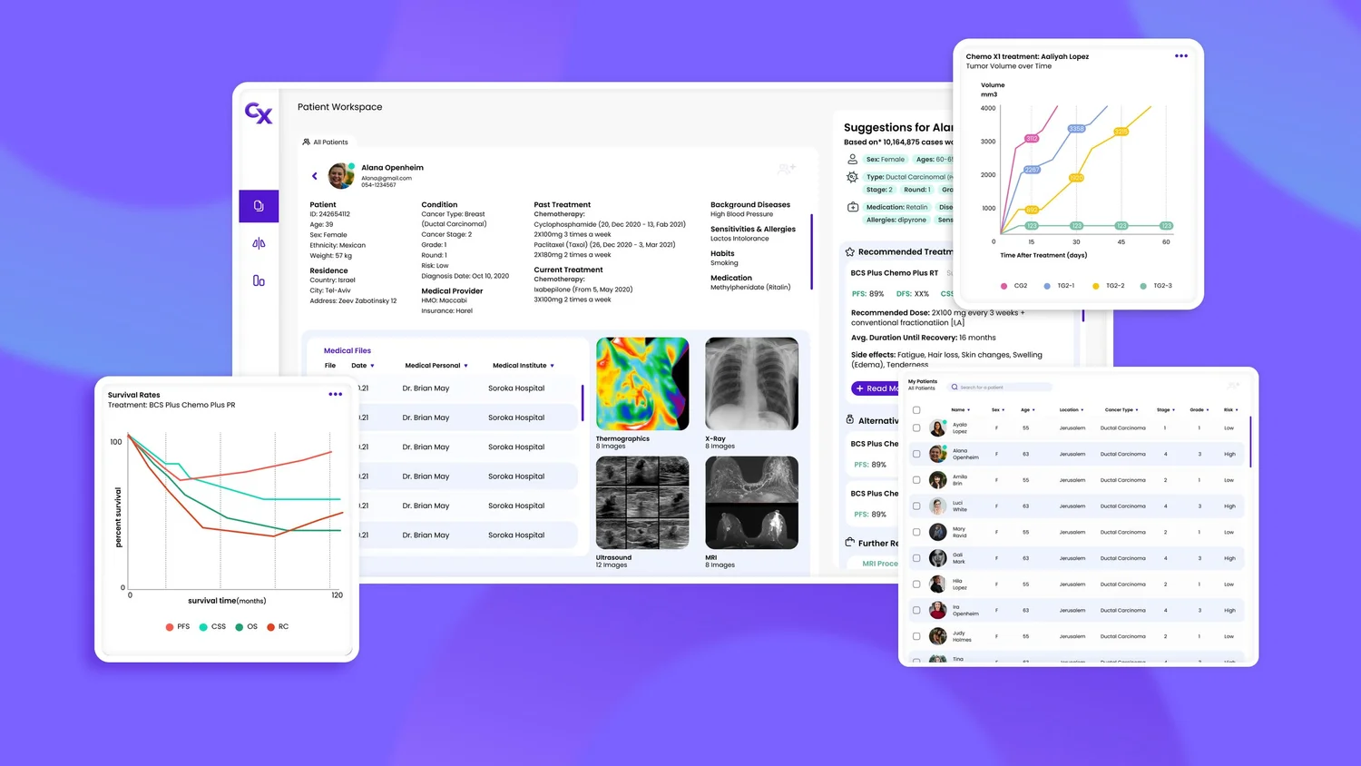
KEEELONCO is a research-led SaaS concept that explores how oncologists could manage patient information, review data-informed treatment suggestions, and compare complex clinical evidence in one workspace.
Scope note: ONCO was an educational product-design concept. It was not clinically validated, connected to real patient data, or released as a medical device.
Oncologists manage long-running patient histories while consulting medical records, research, treatment protocols, articles, and separate software systems. The project began with a question: how might one workspace reduce that fragmentation without flattening clinical complexity?
Our initial concept used aggregated, de-identified case data to surface potentially relevant treatment evidence alongside each patient's medical context. The clinician would remain the decision-maker, with the system supporting research and comparison rather than prescribing care.
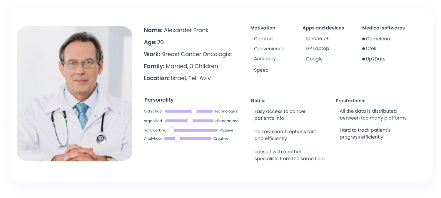
We interviewed three doctors from different specialties to understand where information overload appeared in daily work.
Clinicians described moving between multiple software systems, websites, books, and professional sources while reviewing a case.
Doctors wanted a faster way to compare relevant treatment evidence across similar cases, local context, and global data.
Patients in treatment over many years accumulate large histories that are difficult to scan, organize, and act on efficiently.
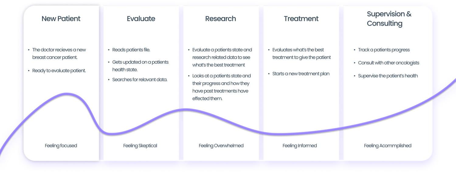
The first idea was expansive: an all-in-one oncology platform powered by worldwide data. The product-design challenge was to identify the smallest coherent experience that could test whether centralized information and comparison were useful.
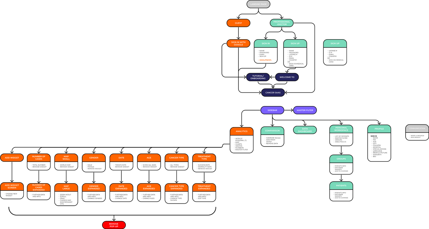
We prioritized four flows around the clinician's core workspace and treated global statistics as a beta concept rather than allowing it to dominate the first experience.
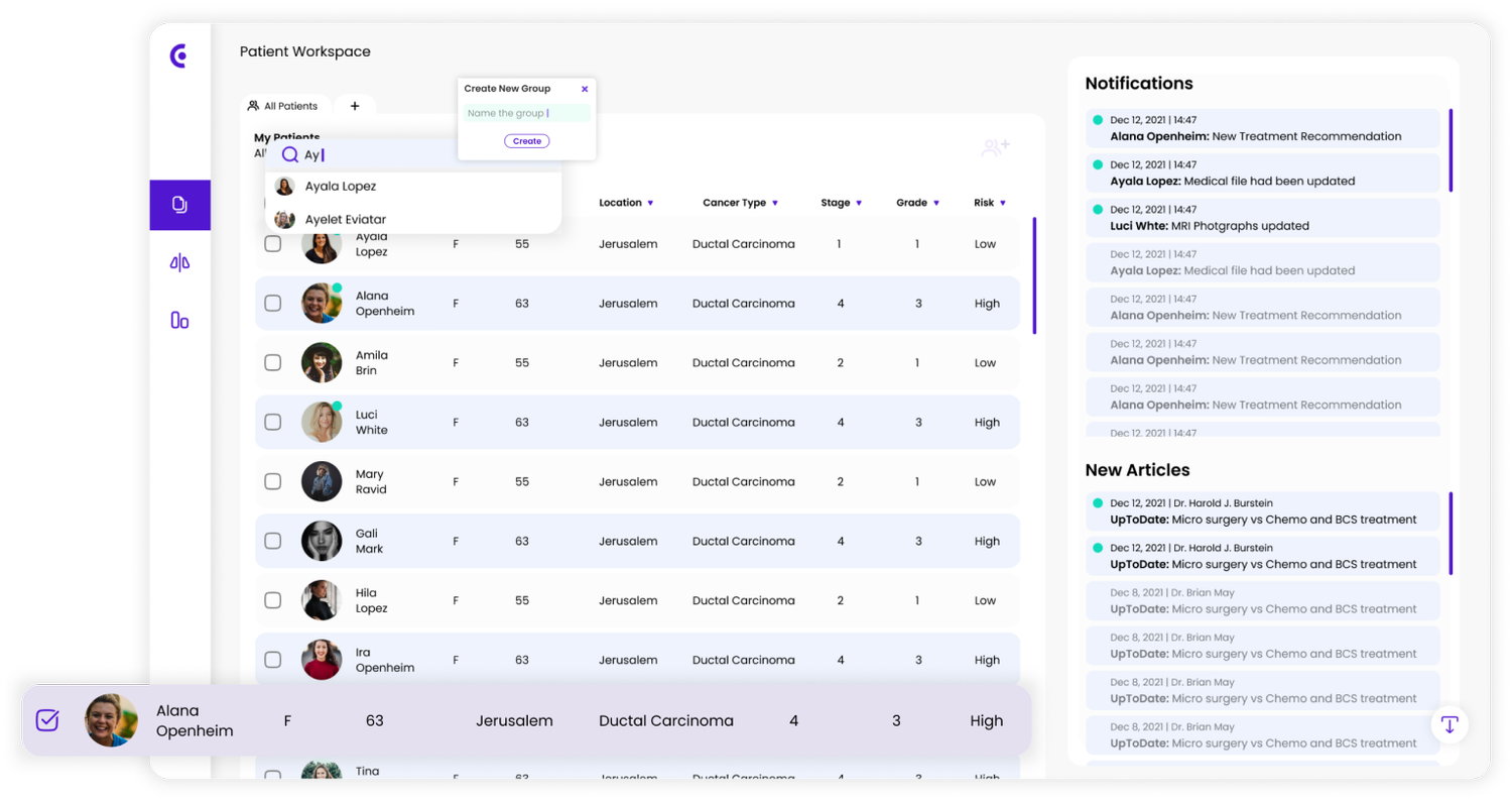
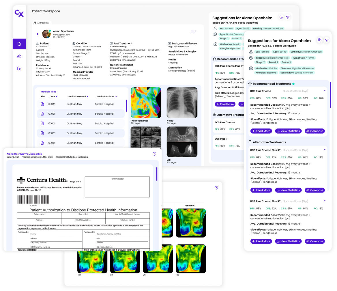
The interface had to make extensive patient and treatment information scannable without hiding what clinicians might need next.
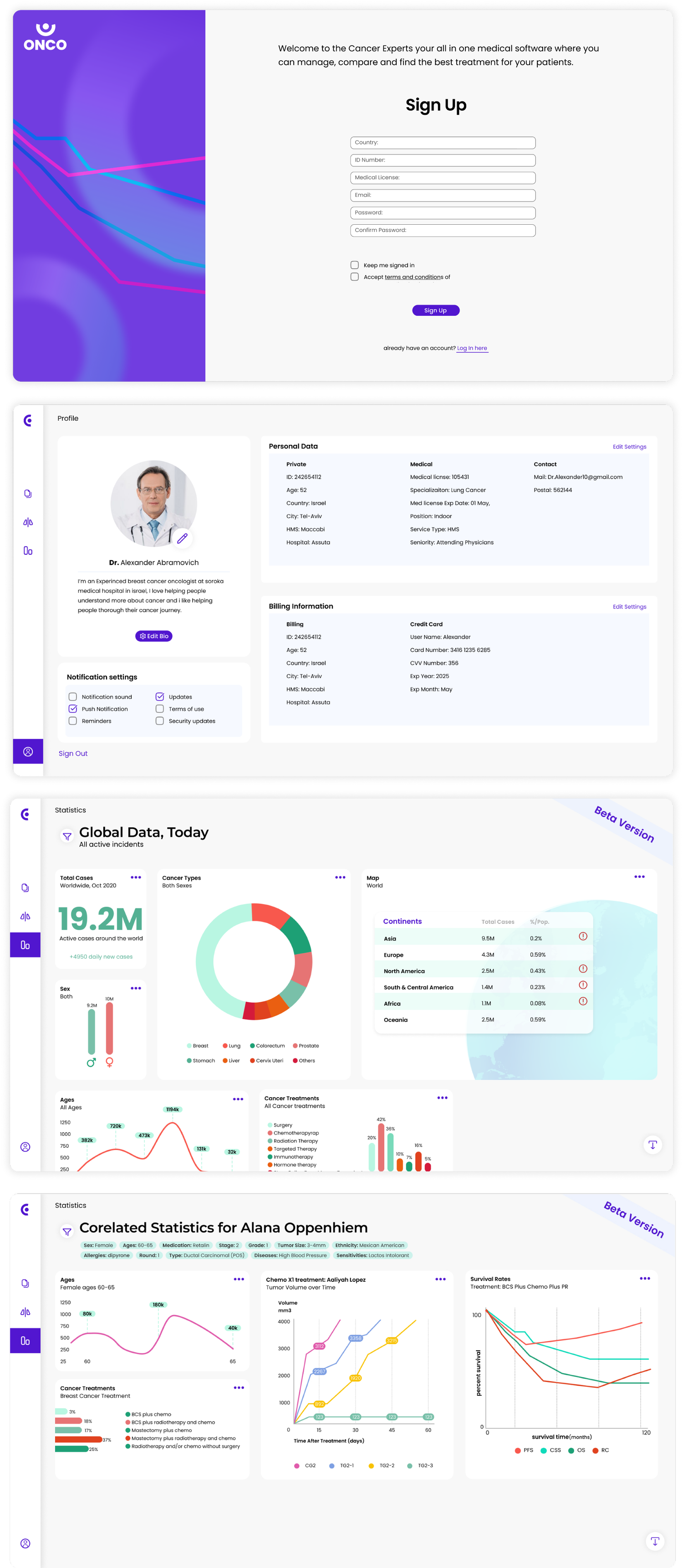
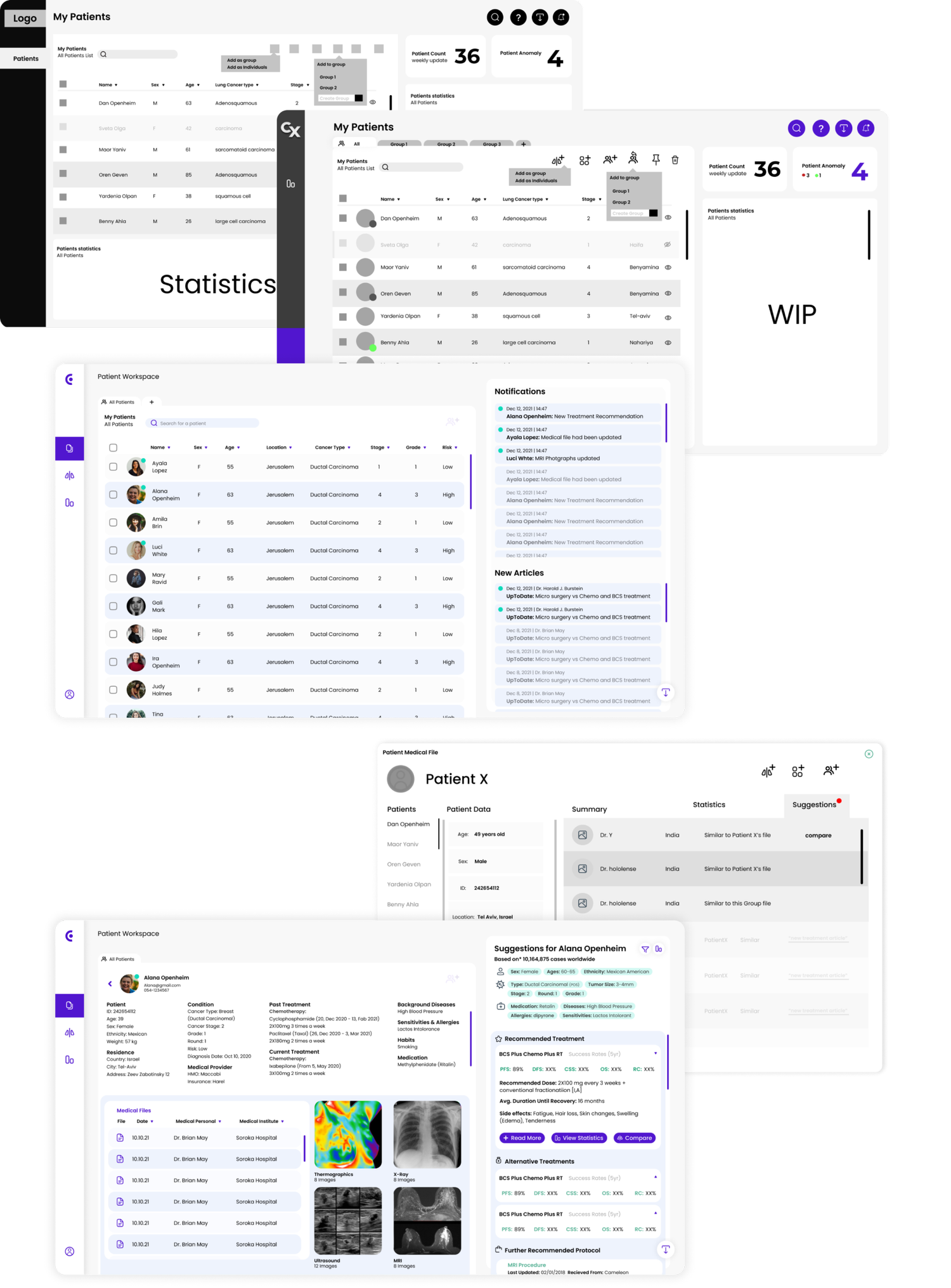
History, conditions, files, imaging, notifications, and suggested treatment evidence remain connected to the active patient.
Side-by-side treatment cards and filters help the clinician inspect evidence rather than mentally combining information across sources.
Search, groups, filters, and notifications support both portfolio-level monitoring and individual case review.

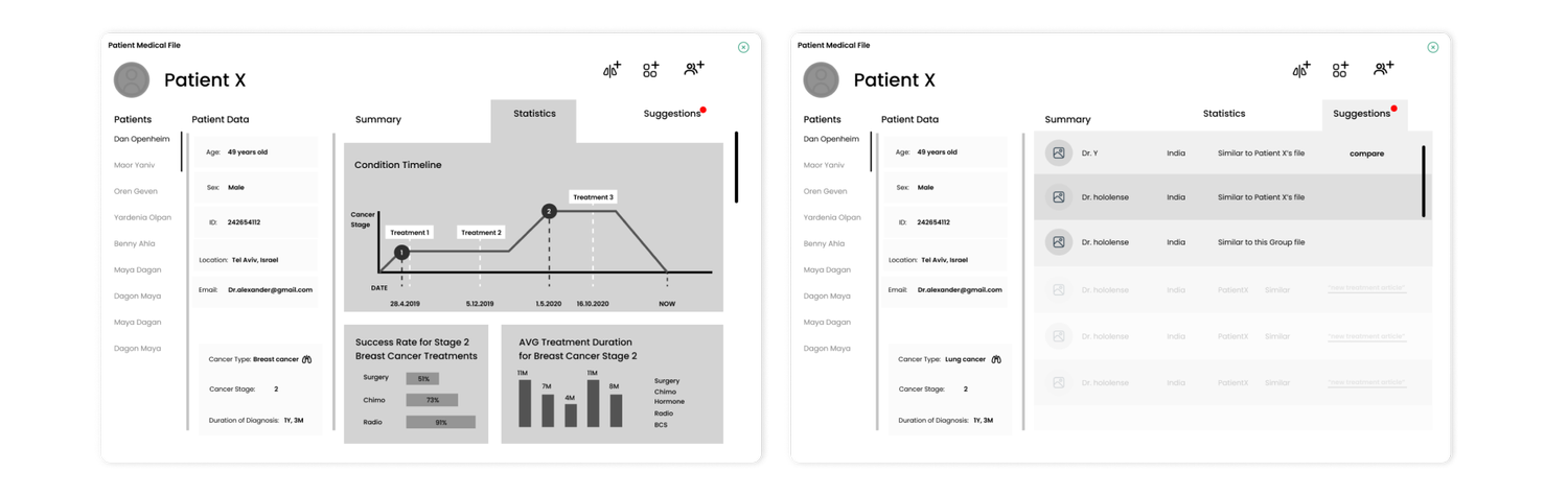
We moved from sketches and low-fidelity wireframes into a connected prototype, using each level of fidelity to resolve a different kind of uncertainty.
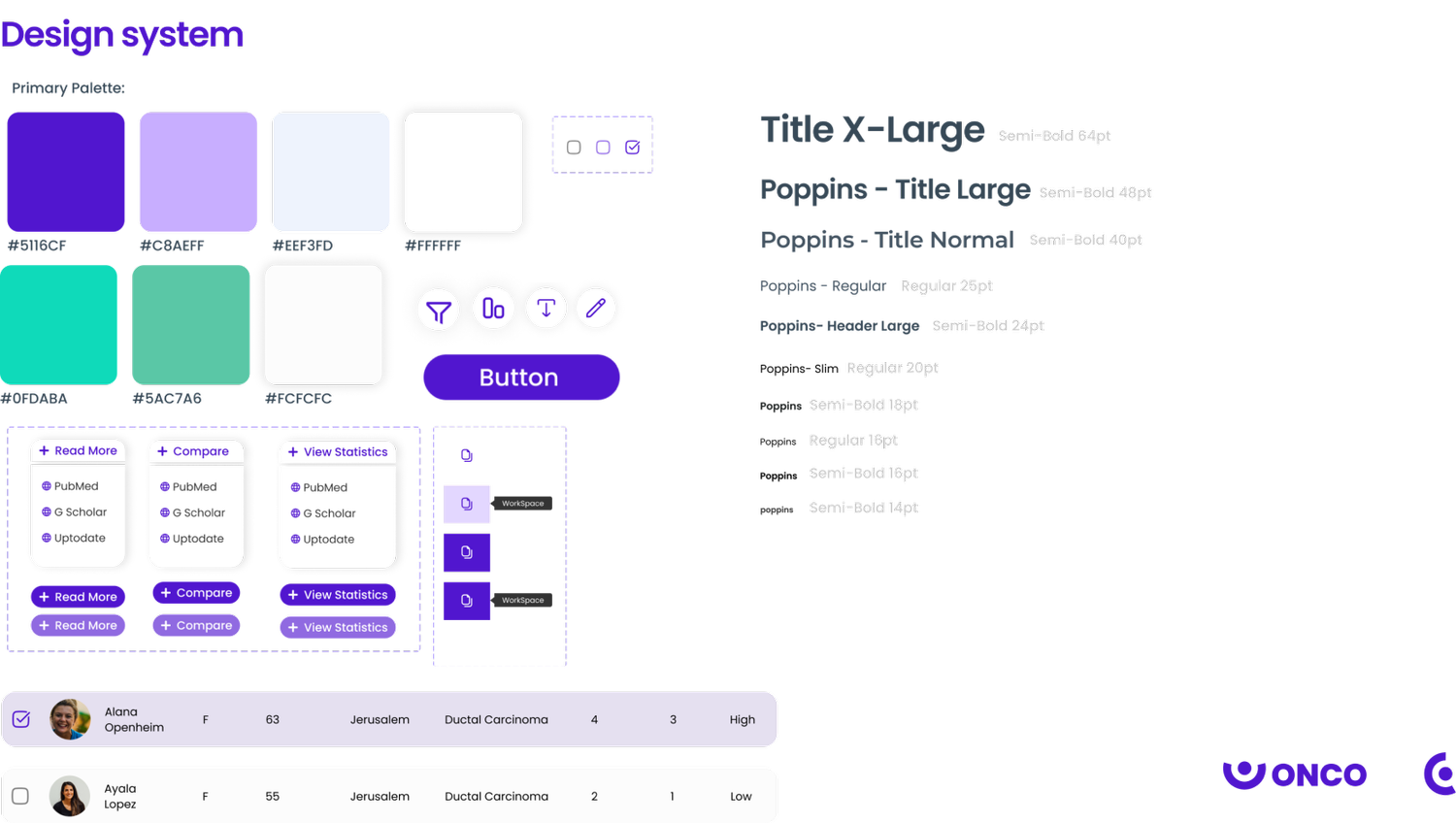
We conducted task-based usability testing with three participants and tracked binary task success. The small sample could not validate clinical usefulness, but it exposed interaction and comprehension problems in the prototype.
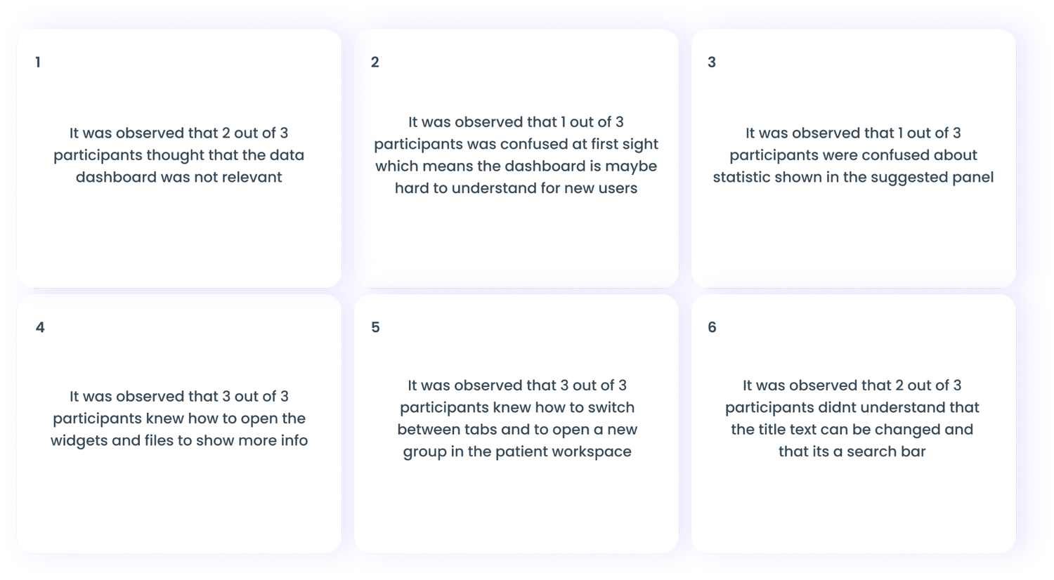
Two of three participants initially considered the dashboard data irrelevant. One of three found the dashboard difficult to understand at first sight, and one of three was confused by statistics inside the suggestion panel. Two of three did not recognize that the patient-list title also functioned as search.
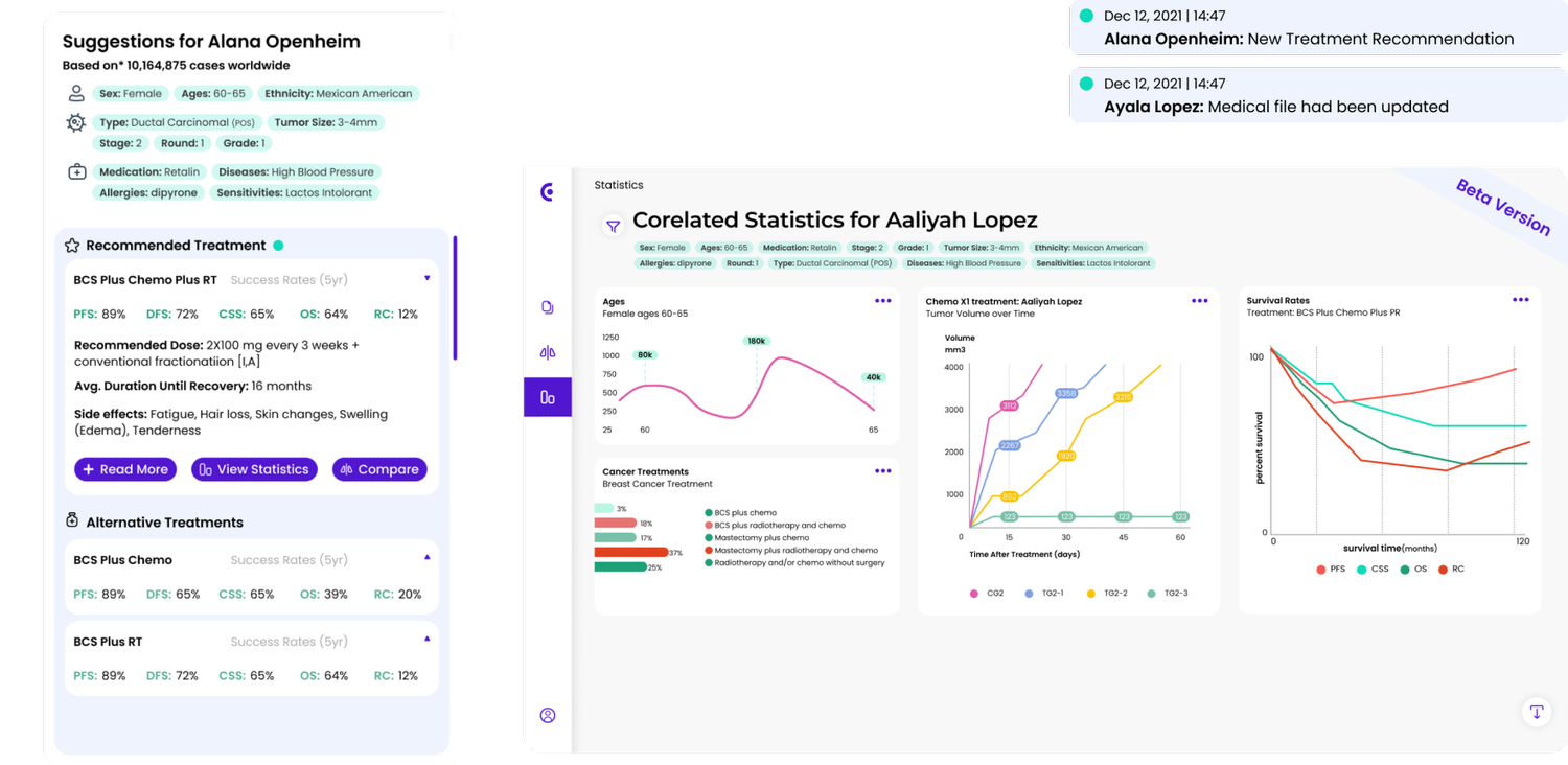
The suggestion panel was restructured so patient context, treatment evidence, success-rate data, and actions formed a clearer hierarchy.
Looking back, the most important product lesson is that healthcare software cannot be evaluated on usability alone. A real ONCO product would require evidence quality, clinical validation, privacy, security, interoperability, bias monitoring, explainability, auditability, and regulatory review.
The product should never present a treatment suggestion as authority. It would need to reveal provenance and uncertainty, support clinician judgment, and define accountability before any real-world use.
Research changes the product boundaryThe interviews shifted the work from a broad data dashboard toward patient organization, evidence comparison, and workflow continuity.
Prioritization turns ambition into something testableDefining four core flows helped the team evaluate the central value proposition before expanding the concept.
Testing can disprove interface assumptions quicklyEven three participants identified patterns that looked obvious to the team but were not obvious in use.
High-stakes products demand humilityA polished concept can demonstrate product thinking, but real medical impact requires scientific, ethical, technical, and regulatory evidence far beyond a prototype.
Four months from research question to a connected, iterated SaaS prototype.